Wednesday, May 23, 2018

Principal Component Analysis with Python

The amount of data generated each day from sources such as scientific experiments, cell phones, and smartwatches has been growing exponentially over the last several years. Not only are the number data sources increasing, but the data itself is also growing richer as the number of features in the data increases. Datasets with a large number of features are called high-dimensional datasets.
One example of high-dimensional data is high-resolution image data, where the features are pixels, and which increase in dimensionality as sensor technology improves. Another example is user movie ratings, where the features are movies rated, and where the number of dimensions increases as the user rates more of them.
Datasets that have a large number features pose a unique challenge for machine learning analysis. We know that machine learning models can be used to classify or cluster data in order to predict future events. However, high-dimensional datasets add complexity to certain machine learning models (i.e. linear models) and, as a result, models that train on datasets with a large number features are more prone to producing error due to bias.

PCA Primer

Principal Component Analysis (PCA) is a dimensionality reduction technique used to transform high-dimensional datasets into a dataset with fewer variables, where the set of resulting variables explains the maximum variance within the dataset. PCA is used prior to unsupervised and supervised machine learning steps to reduce the number of features used in the analysis, thereby reducing the likelihood of error.
Consider data from a movie rating system where the movie ratings from different users are instances, and the various movies are features.


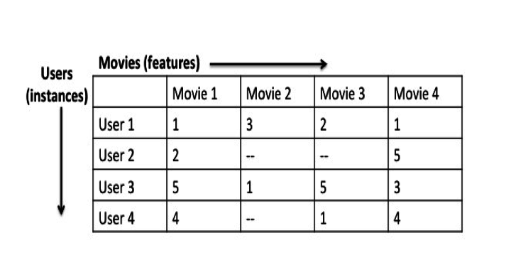
In this dataset, you might observe that users who rank Star Wars Episode IVhighly might also rank Rogue One: A Star Wars Story highly. In other words, the ratings for Star Wars Episode IV are positively correlated with the ones for Rogue One: A Star Wars Story. One could image that all movies ranked by certain users in a similar way might all share similar attributes (ex. all movies with these ratings are classic sci-fi movies), and could ultimately be grouped together to form a new feature.


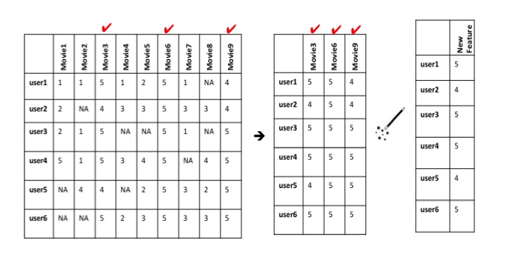
This is an intuitive way of grouping data, but it would take quite some time to read through all of the data and group it according to similar attributes. Fortunately, there are algorithms that can automatically group features that vary in a similar way within high-dimensional datasets, such as Principal Component Analysis.
The overall goal of PCA is to reduce the number of d dimensions (features) in a dataset by projecting it onto a k dimensional subspace where k < d. The approach used to complete PCA can be summarized as follows:
  1. Standardize the data.
  2. Use the standardized data to generate a covariance matrix (or perform Singular Vector Decomposition).
  3. Obtain eigenvectors (principal components) and eigenvalues from the covariance matrix. Each eigenvector will have a corresponding eigenvalue.
  4. Sort the eigenvalues in descending order.
  5. Select the k eigenvectors with the largest eigenvalues, where k is the number of dimensions used in the new feature space (k≤d).
  6. Construct a new matrix with the selected k eigenvectors.

Tutorial

In this post, we’ll use a high-dimensional movie rating dataset to illustrate how to apply Principal Component Analysis (PCA) to compress the data. This tutorial picks up after having created csv files from the data. If you want to pick up where this tutorial starts, you can find the pre-made csv files here.

Step 1: Load and Standardize Data

First we’ll load the data and store it in a pandas dataframe. The data set contains ratings from 718 users (instances) for 8,913 movies (features). Even though all of the features in the dataset are measured on the same scale (a 0 through 5 rating), we must make sure that we standardize the data by transforming it onto a unit scale (mean=0 and variance=1). Also, all null (NaN) values were converted to 0. It is necessary to transform data because PCA can only be applied on numerical data.
#Load dependencies
import pandas as pd
import numpy as np
from sklearn.preprocessing import StandardScaler
from matplotlib import*
import matplotlib.pyplot as plt
from matplotlib.cm import register_cmap
from scipy import stats
from sklearn.decomposition import PCA as sklearnPCA
import seaborn
#Load movie names and movie ratings
movies = pd.read_csv('movies.csv')
ratings = pd.read_csv('ratings.csv')
ratings.drop(['timestamp'], axis=1, inplace=True)
def replace_name(x):
    return movies[movies['movieId']==x].title.values[0]
ratings.movieId = ratings.movieId.map(replace_name)
M = ratings.pivot_table(index=['userId'], columns=['movieId'], values='rating')
m = M.shape
df1 = M.replace(np.nan, 0, regex=True)
X_std = StandardScaler().fit_transform(df1)

Step 2: Covariance Matrix and Eigendecomposition

Next, a covariance matrix is created based on the standardized data. The covariance matrix is a representation of the covariance between each feature in the original dataset.
The covariance matrix can be found as follows:
mean_vec = np.mean(X_std, axis=0)
cov_mat = (X_std - mean_vec).T.dot((X_std - mean_vec)) / (X_std.shape[0]-1)
print('Covariance matrix \n%s' %cov_mat)
Alternatively, you can also create the same covariance matrix with one line of code.
print('NumPy covariance matrix: \n%s' %np.cov(X_std.T))
Covariance matrix 
    [[ 1.0013947  -0.00276421 -0.00195661 ..., -0.00858289 -0.00321221
      -0.01055463]
     [-0.00276421  1.0013947  -0.00197311 ...,  0.14004611 -0.0032393
      -0.01064364]
     [-0.00195661 -0.00197311  1.0013947  ..., -0.00612653 -0.0022929
      -0.00753398]
     ..., 
     [-0.00858289  0.14004611 -0.00612653 ...,  1.0013947   0.02888777
       0.14005644]
     [-0.00321221 -0.0032393  -0.0022929  ...,  0.02888777  1.0013947
       0.01676203]
     [-0.01055463 -0.01064364 -0.00753398 ...,  0.14005644  0.01676203
       1.0013947 ]]
    NumPy covariance matrix: 
    [[ 1.0013947  -0.00276421 -0.00195661 ..., -0.00858289 -0.00321221
      -0.01055463]
     [-0.00276421  1.0013947  -0.00197311 ...,  0.14004611 -0.0032393
      -0.01064364]
     [-0.00195661 -0.00197311  1.0013947  ..., -0.00612653 -0.0022929
      -0.00753398]
     ..., 
     [-0.00858289  0.14004611 -0.00612653 ...,  1.0013947   0.02888777
       0.14005644]
     [-0.00321221 -0.0032393  -0.0022929  ...,  0.02888777  1.0013947
       0.01676203]
     [-0.01055463 -0.01064364 -0.00753398 ...,  0.14005644  0.01676203
       1.0013947 ]]
After the covariance matrix is generated, eigendecomposition is performed on the covariance matrix. Eigenvectors and eigenvalues are found as a result of the eigendceomposition. Each eigenvector has a corresponding eigenvalue, and the sum of the eigenvalues represents all of the variance within the entire dataset.
The eigendecomposition can be performed as follows:
#Perform eigendecomposition on covariance matrix
cov_mat = np.cov(X_std.T)
eig_vals, eig_vecs = np.linalg.eig(cov_mat)
print('Eigenvectors \n%s' %eig_vecs)
print('\nEigenvalues \n%s' %eig_vals)

Step 3: Selecting Principal Components

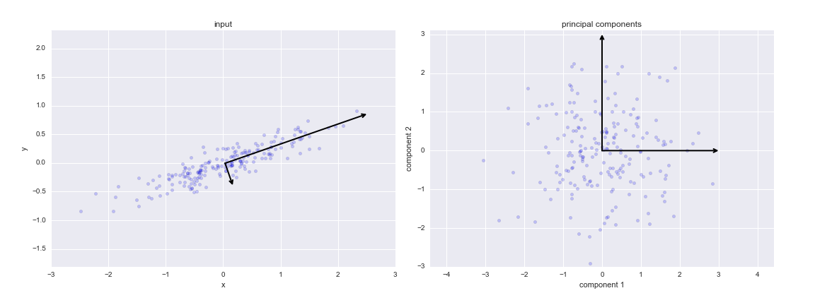
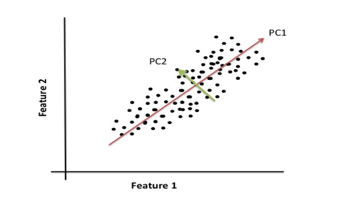
Eigenvectors, or principal components, are a normalized linear combination of the features in the original dataset. The first principal component captures the most variance in the original variables, and the second component is a representation of the second highest variance within the dataset.
For example, if you were to plot data from a dataset that contains two features, the following illustrates that principal component 1 (PC1) represents the direction of the most variation between the two features and principal component 2 (PC2) represents the second most variation between the two plotted features. Our movies dataset contains over 8,000 features and would be difficult to visualize which is why we used eigendecomposition to generate the eigenvectors.


The eigenvectors with the lowest eigenvalues describe the least amount of variation within the dataset. Therefore, these values can be dropped. First, lets order the eigenvalues in descending order:
# Visually confirm that the list is correctly sorted by decreasing eigenvalues
eig_pairs = [(np.abs(eig_vals[i]), eig_vecs[:,i]) for i in range(len(eig_vals))]
print('Eigenvalues in descending order:')
for i in eig_pairs:
    print(i[0])
To get a better idea of how principal components describe the variance in the data, we will look at the explained variance ratio of the first two principal components.
pca = PCA(n_components=2)
pca.fit_transform(df1)
print pca.explained_variance_ratio_
The first two principal components describe approximately 14% of the variance in the data. In order gain a more comprehensive view of how each principal component explains the variance within the data, we will construct a scree plot. A scree plot displays the variance explained by each principal component within the analysis.
#Explained variance
pca = PCA().fit(X_std)
plt.plot(np.cumsum(pca.explained_variance_ratio_))
plt.xlabel('number of components')
plt.ylabel('cumulative explained variance')
plt.show()
Our scree plot shows that the first 480 principal components describe most of the variation (information) within the data. This is a major reduction from the initial 8,913 features. Therefore, the first 480 eigenvectors should be used to construct the dimensions for the new feature space.

Challenge

Try it on your own with a larger data set. What impact do you think a data set with more instances, but similar number of features would have on the resulting number of principal components (our kvalue)? What impact would a dataset with a larger number of features have on the resulting number of principal components?

References

  1. http://scikit-learn.org/stable/modules/decomposition.html
  2. http://scikit-learn.org/stable/modules/unsupervised_reduction.html
  3. Raschka, Sebastian. Principle Component Analysis in 3 Simple Steps, (2015)
  4. http://www.analyticsvidhya.com/blog/2016/03/practical-guide-principal-component-analysis-python/
  5. http://support.minitab.com/en-us/minitab/17/topic-library/modeling-statistics/multivariate/principal-components-and-factor-analysis/what-is-a-scree-plot/
  6. F. Maxwell Harper and Joseph A. Konstan. 2015. The MovieLens Datasets: History and Context. ACM Transactions on Interactive Intelligent Systems (TiiS) 5, 4, Article 19 (December 2015), 19 pages
  7. https://github.com/databricks/spark-training/tree/master/data/movielens/medium

Principal Component Analysis

Up until now, we have been looking in depth at supervised learning estimators: those estimators that predict labels based on labeled training data. Here we begin looking at several unsupervised estimators, which can highlight interesting aspects of the data without reference to any known labels.
In this section, we explore what is perhaps one of the most broadly used of unsupervised algorithms, principal component analysis (PCA). PCA is fundamentally a dimensionality reduction algorithm, but it can also be useful as a tool for visualization, for noise filtering, for feature extraction and engineering, and much more. After a brief conceptual discussion of the PCA algorithm, we will see a couple examples of these further applications.
We begin with the standard imports:
In [1]:
%matplotlib inline
import numpy as np
import matplotlib.pyplot as plt
import seaborn as sns; sns.set()

Introducing Principal Component Analysis

Principal component analysis is a fast and flexible unsupervised method for dimensionality reduction in data, which we saw briefly in Introducing Scikit-Learn. Its behavior is easiest to visualize by looking at a two-dimensional dataset. Consider the following 200 points:
In [2]:
rng = np.random.RandomState(1)
X = np.dot(rng.rand(2, 2), rng.randn(2, 200)).T
plt.scatter(X[:, 0], X[:, 1])
plt.axis('equal');
By eye, it is clear that there is a nearly linear relationship between the x and y variables. This is reminiscent of the linear regression data we explored in In Depth: Linear Regression, but the problem setting here is slightly different: rather than attempting to predict the y values from the x values, the unsupervised learning problem attempts to learn about the relationship between the x and y values.
In principal component analysis, this relationship is quantified by finding a list of the principal axes in the data, and using those axes to describe the dataset. Using Scikit-Learn's PCA estimator, we can compute this as follows:
In [3]:
from sklearn.decomposition import PCA
pca = PCA(n_components=2)
pca.fit(X)
Out[3]:
PCA(copy=True, n_components=2, whiten=False)
The fit learns some quantities from the data, most importantly the "components" and "explained variance":
In [4]:
print(pca.components_)
[[ 0.94446029  0.32862557]
 [ 0.32862557 -0.94446029]]
In [5]:
print(pca.explained_variance_)
[ 0.75871884  0.01838551]
To see what these numbers mean, let's visualize them as vectors over the input data, using the "components" to define the direction of the vector, and the "explained variance" to define the squared-length of the vector:
In [6]:
def draw_vector(v0, v1, ax=None):
    ax = ax or plt.gca()
    arrowprops=dict(arrowstyle='->',
                    linewidth=2,
                    shrinkA=0, shrinkB=0)
    ax.annotate('', v1, v0, arrowprops=arrowprops)

# plot data
plt.scatter(X[:, 0], X[:, 1], alpha=0.2)
for length, vector in zip(pca.explained_variance_, pca.components_):
    v = vector * 3 * np.sqrt(length)
    draw_vector(pca.mean_, pca.mean_ + v)
plt.axis('equal');
These vectors represent the principal axes of the data, and the length of the vector is an indication of how "important" that axis is in describing the distribution of the data—more precisely, it is a measure of the variance of the data when projected onto that axis. The projection of each data point onto the principal axes are the "principal components" of the data.
If we plot these principal components beside the original data, we see the plots shown here:
This transformation from data axes to principal axes is an affine transformation, which basically means it is composed of a translation, rotation, and uniform scaling.
While this algorithm to find principal components may seem like just a mathematical curiosity, it turns out to have very far-reaching applications in the world of machine learning and data exploration.

PCA as dimensionality reduction

Using PCA for dimensionality reduction involves zeroing out one or more of the smallest principal components, resulting in a lower-dimensional projection of the data that preserves the maximal data variance.
Here is an example of using PCA as a dimensionality reduction transform:
In [7]:
pca = PCA(n_components=1)
pca.fit(X)
X_pca = pca.transform(X)
print("original shape:   ", X.shape)
print("transformed shape:", X_pca.shape)
original shape:    (200, 2)
transformed shape: (200, 1)
The transformed data has been reduced to a single dimension. To understand the effect of this dimensionality reduction, we can perform the inverse transform of this reduced data and plot it along with the original data:
In [8]:
X_new = pca.inverse_transform(X_pca)
plt.scatter(X[:, 0], X[:, 1], alpha=0.2)
plt.scatter(X_new[:, 0], X_new[:, 1], alpha=0.8)
plt.axis('equal');
The light points are the original data, while the dark points are the projected version. This makes clear what a PCA dimensionality reduction means: the information along the least important principal axis or axes is removed, leaving only the component(s) of the data with the highest variance. The fraction of variance that is cut out (proportional to the spread of points about the line formed in this figure) is roughly a measure of how much "information" is discarded in this reduction of dimensionality.
This reduced-dimension dataset is in some senses "good enough" to encode the most important relationships between the points: despite reducing the dimension of the data by 50%, the overall relationship between the data points are mostly preserved.

PCA for visualization: Hand-written digits

The usefulness of the dimensionality reduction may not be entirely apparent in only two dimensions, but becomes much more clear when looking at high-dimensional data. To see this, let's take a quick look at the application of PCA to the digits data we saw in In-Depth: Decision Trees and Random Forests.
We start by loading the data:
In [9]:
from sklearn.datasets import load_digits
digits = load_digits()
digits.data.shape
Out[9]:
(1797, 64)
Recall that the data consists of 8×8 pixel images, meaning that they are 64-dimensional. To gain some intuition into the relationships between these points, we can use PCA to project them to a more manageable number of dimensions, say two:
In [10]:
pca = PCA(2)  # project from 64 to 2 dimensions
projected = pca.fit_transform(digits.data)
print(digits.data.shape)
print(projected.shape)
(1797, 64)
(1797, 2)
We can now plot the first two principal components of each point to learn about the data:
In [11]:
plt.scatter(projected[:, 0], projected[:, 1],
            c=digits.target, edgecolor='none', alpha=0.5,
            cmap=plt.cm.get_cmap('spectral', 10))
plt.xlabel('component 1')
plt.ylabel('component 2')
plt.colorbar();
Recall what these components mean: the full data is a 64-dimensional point cloud, and these points are the projection of each data point along the directions with the largest variance. Essentially, we have found the optimal stretch and rotation in 64-dimensional space that allows us to see the layout of the digits in two dimensions, and have done this in an unsupervised manner—that is, without reference to the labels.

What do the components mean?

We can go a bit further here, and begin to ask what the reduced dimensions mean. This meaning can be understood in terms of combinations of basis vectors. For example, each image in the training set is defined by a collection of 64 pixel values, which we will call the vector x:
x=[x1,x2,x3x64]
One way we can think about this is in terms of a pixel basis. That is, to construct the image, we multiply each element of the vector by the pixel it describes, and then add the results together to build the image:
image(x)=x1(pixel 1)+x2(pixel 2)+x3(pixel 3)x64(pixel 64)
One way we might imagine reducing the dimension of this data is to zero out all but a few of these basis vectors. For example, if we use only the first eight pixels, we get an eight-dimensional projection of the data, but it is not very reflective of the whole image: we've thrown out nearly 90% of the pixels!
The upper row of panels shows the individual pixels, and the lower row shows the cumulative contribution of these pixels to the construction of the image. Using only eight of the pixel-basis components, we can only construct a small portion of the 64-pixel image. Were we to continue this sequence and use all 64 pixels, we would recover the original image.
But the pixel-wise representation is not the only choice of basis. We can also use other basis functions, which each contain some pre-defined contribution from each pixel, and write something like
image(x)=mean+x1(basis 1)+x2(basis 2)+x3(basis 3)
PCA can be thought of as a process of choosing optimal basis functions, such that adding together just the first few of them is enough to suitably reconstruct the bulk of the elements in the dataset. The principal components, which act as the low-dimensional representation of our data, are simply the coefficients that multiply each of the elements in this series. This figure shows a similar depiction of reconstructing this digit using the mean plus the first eight PCA basis functions:
Unlike the pixel basis, the PCA basis allows us to recover the salient features of the input image with just a mean plus eight components! The amount of each pixel in each component is the corollary of the orientation of the vector in our two-dimensional example. This is the sense in which PCA provides a low-dimensional representation of the data: it discovers a set of basis functions that are more efficient than the native pixel-basis of the input data.

Choosing the number of components

A vital part of using PCA in practice is the ability to estimate how many components are needed to describe the data. This can be determined by looking at the cumulative explained variance ratio as a function of the number of components:
In [12]:
pca = PCA().fit(digits.data)
plt.plot(np.cumsum(pca.explained_variance_ratio_))
plt.xlabel('number of components')
plt.ylabel('cumulative explained variance');
This curve quantifies how much of the total, 64-dimensional variance is contained within the first N components. For example, we see that with the digits the first 10 components contain approximately 75% of the variance, while you need around 50 components to describe close to 100% of the variance.
Here we see that our two-dimensional projection loses a lot of information (as measured by the explained variance) and that we'd need about 20 components to retain 90% of the variance. Looking at this plot for a high-dimensional dataset can help you understand the level of redundancy present in multiple observations.

PCA as Noise Filtering

PCA can also be used as a filtering approach for noisy data. The idea is this: any components with variance much larger than the effect of the noise should be relatively unaffected by the noise. So if you reconstruct the data using just the largest subset of principal components, you should be preferentially keeping the signal and throwing out the noise.
Let's see how this looks with the digits data. First we will plot several of the input noise-free data:
In [13]:
def plot_digits(data):
    fig, axes = plt.subplots(4, 10, figsize=(10, 4),
                             subplot_kw={'xticks':[], 'yticks':[]},
                             gridspec_kw=dict(hspace=0.1, wspace=0.1))
    for i, ax in enumerate(axes.flat):
        ax.imshow(data[i].reshape(8, 8),
                  cmap='binary', interpolation='nearest',
                  clim=(0, 16))
plot_digits(digits.data)
Now lets add some random noise to create a noisy dataset, and re-plot it:
In [14]:
np.random.seed(42)
noisy = np.random.normal(digits.data, 4)
plot_digits(noisy)
It's clear by eye that the images are noisy, and contain spurious pixels. Let's train a PCA on the noisy data, requesting that the projection preserve 50% of the variance:
In [15]:
pca = PCA(0.50).fit(noisy)
pca.n_components_
Out[15]:
12
Here 50% of the variance amounts to 12 principal components. Now we compute these components, and then use the inverse of the transform to reconstruct the filtered digits:
In [16]:
components = pca.transform(noisy)
filtered = pca.inverse_transform(components)
plot_digits(filtered)
This signal preserving/noise filtering property makes PCA a very useful feature selection routine—for example, rather than training a classifier on very high-dimensional data, you might instead train the classifier on the lower-dimensional representation, which will automatically serve to filter out random noise in the inputs.

Example: Eigenfaces

Earlier we explored an example of using a PCA projection as a feature selector for facial recognition with a support vector machine (see In-Depth: Support Vector Machines). Here we will take a look back and explore a bit more of what went into that. Recall that we were using the Labeled Faces in the Wild dataset made available through Scikit-Learn:
In [17]:
from sklearn.datasets import fetch_lfw_people
faces = fetch_lfw_people(min_faces_per_person=60)
print(faces.target_names)
print(faces.images.shape)
['Ariel Sharon' 'Colin Powell' 'Donald Rumsfeld' 'George W Bush'
 'Gerhard Schroeder' 'Hugo Chavez' 'Junichiro Koizumi' 'Tony Blair']
(1348, 62, 47)
Let's take a look at the principal axes that span this dataset. Because this is a large dataset, we will use RandomizedPCA—it contains a randomized method to approximate the first N principal components much more quickly than the standard PCA estimator, and thus is very useful for high-dimensional data (here, a dimensionality of nearly 3,000). We will take a look at the first 150 components:
In [18]:
from sklearn.decomposition import RandomizedPCA
pca = RandomizedPCA(150)
pca.fit(faces.data)
Out[18]:
RandomizedPCA(copy=True, iterated_power=3, n_components=150,
       random_state=None, whiten=False)
In this case, it can be interesting to visualize the images associated with the first several principal components (these components are technically known as "eigenvectors," so these types of images are often called "eigenfaces"). As you can see in this figure, they are as creepy as they sound:
In [19]:
fig, axes = plt.subplots(3, 8, figsize=(9, 4),
                         subplot_kw={'xticks':[], 'yticks':[]},
                         gridspec_kw=dict(hspace=0.1, wspace=0.1))
for i, ax in enumerate(axes.flat):
    ax.imshow(pca.components_[i].reshape(62, 47), cmap='bone')
The results are very interesting, and give us insight into how the images vary: for example, the first few eigenfaces (from the top left) seem to be associated with the angle of lighting on the face, and later principal vectors seem to be picking out certain features, such as eyes, noses, and lips. Let's take a look at the cumulative variance of these components to see how much of the data information the projection is preserving:
In [20]:
plt.plot(np.cumsum(pca.explained_variance_ratio_))
plt.xlabel('number of components')
plt.ylabel('cumulative explained variance');
We see that these 150 components account for just over 90% of the variance. That would lead us to believe that using these 150 components, we would recover most of the essential characteristics of the data. To make this more concrete, we can compare the input images with the images reconstructed from these 150 components:
In [21]:
# Compute the components and projected faces
pca = RandomizedPCA(150).fit(faces.data)
components = pca.transform(faces.data)
projected = pca.inverse_transform(components)
In [22]:
# Plot the results
fig, ax = plt.subplots(2, 10, figsize=(10, 2.5),
                       subplot_kw={'xticks':[], 'yticks':[]},
                       gridspec_kw=dict(hspace=0.1, wspace=0.1))
for i in range(10):
    ax[0, i].imshow(faces.data[i].reshape(62, 47), cmap='binary_r')
    ax[1, i].imshow(projected[i].reshape(62, 47), cmap='binary_r')
    
ax[0, 0].set_ylabel('full-dim\ninput')
ax[1, 0].set_ylabel('150-dim\nreconstruction');
The top row here shows the input images, while the bottom row shows the reconstruction of the images from just 150 of the ~3,000 initial features. This visualization makes clear why the PCA feature selection used in In-Depth: Support Vector Machines was so successful: although it reduces the dimensionality of the data by nearly a factor of 20, the projected images contain enough information that we might, by eye, recognize the individuals in the image. What this means is that our classification algorithm needs to be trained on 150-dimensional data rather than 3,000-dimensional data, which depending on the particular algorithm we choose, can lead to a much more efficient classification.

Principal Component Analysis Summary

In this section we have discussed the use of principal component analysis for dimensionality reduction, for visualization of high-dimensional data, for noise filtering, and for feature selection within high-dimensional data. Because of the versatility and interpretability of PCA, it has been shown to be effective in a wide variety of contexts and disciplines. Given any high-dimensional dataset, I tend to start with PCA in order to visualize the relationship between points (as we did with the digits), to understand the main variance in the data (as we did with the eigenfaces), and to understand the intrinsic dimensionality (by plotting the explained variance ratio). Certainly PCA is not useful for every high-dimensional dataset, but it offers a straightforward and efficient path to gaining insight into high-dimensional data.
PCA's main weakness is that it tends to be highly affected by outliers in the data. For this reason, many robust variants of PCA have been developed, many of which act to iteratively discard data points that are poorly described by the initial components. Scikit-Learn contains a couple interesting variants on PCA, including RandomizedPCA and SparsePCA, both also in the sklearn.decomposition submodule. RandomizedPCA, which we saw earlier, uses a non-deterministic method to quickly approximate the first few principal components in very high-dimensional data, while SparsePCA introduces a regularization term (see In Depth: Linear Regression) that serves to enforce sparsity of the components.
In the following sections, we will look at other unsupervised learning methods that build on some of the ideas of PCA.